
Back when the only way to use the internet was to sit at a desk and use a standard, computer, plus keyboard and monitor setup, designing a web page was a lot more straightforward. Monitor sizes did vary a bit, but not so much that a page would be thrown seriously out of whack if it was viewed on different screens. Laptops, for the most part, also kept to a fairly similar shape and, although the screens got a bit smaller, they weren’t that much smaller than the older monitors that were still generally catered for.
Then, with startling swiftness, things changed. People no longer wanted to sit in one place to use the internet – they bought new devices that allowed them to carry the internet around in their pocket, to be taken out and accessed whenever and wherever they wanted. The age of mobile internet had arrived, and web design was going to have to change to accommodate it. Fast forward to late 2018 and phones and tablets now account for more than half of all internet use. This means that if you have a website that is not yet optimized for mobile devices, then you are now limiting yourself to less than 50% of the potential customers online at any given time.
Even if you aren’t concerned about mobile users, for some reason, there’s still a very compelling argument for making sure that your website is as mobile friendly as it can be. The fact is that whether or not you care about optimization for mobile devices, Google cares very much. The degree to which your site is usable on all types of device is already taken into account in Google’s search algorithms and it is clear that mobile optimization will be increasingly prioritized in future – understandably so, since this is what the majority of internet users are browsing on. In other words, sooner or later, if your site isn’t optimized for mobile, your web presence will start to suffer as a result.
If you’re in the print business and have already invested in online design software then, hopefully, your site benefits from mobile responsive web design. If you’re not sure, then it’s worth checking your site on a mobile device to make sure that it functions in the way that you would want it to. If you haven’t yet taken the plunge and are still considering whether custom online designer software is right for your business, then it’s worth talking to a web designer who understands the needs of the print industry. Web2ink specializes in eCommerce for print companies, creating websites with built in web to print online designer software that allows customers to create their design, choose a product to print it on, place and confirm their order from the comfort of…well, wherever they happen to be using their mobile phone, since the software is fully optimized for mobile devices and is also very user friendly.
The Web2ink online designer tool can also be embedded into reseller websites so, if this is the option that you’ve chosen, then you will need to make sure that the resulting page works as you expect it to. After all, if you’re dreaming of building up your own business selling t-shirts but, when the customer tries to use your t-shirt designer software they find themselves only able to see a corner of the design at any time, then you won’t get many orders.
So, what do you have to check, when it comes to making sure that your web pages are easily usable on a phone or tablet?
Probably the first thing that a user will notice if your site isn’t designed with a mobile device in mind is the loading speed. And, yes, Google will notice it too! A slightly slower load time on a desktop computer can turn into a seemingly interminable wait on a mobile phone, which will usually have a slower loading speed anyway. If you’re fixing the issue yourself, then you can start by reducing the amount of content on each page and reducing the size and possibly the pixel quality of your images. If you’re reasonably confident with web design, you can learn how to use AMP (accelerated mobile page) protocols, which provide a format for high-quality yet rapidly loading mobile content. Alternatively, you can talk to a web designer, such as Web2ink, about how they can help you with this.
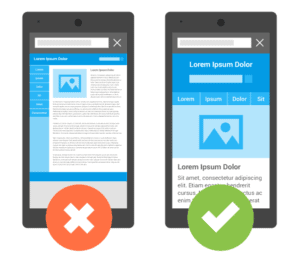
Returning to the subject of images, these can be a major issue for mobile optimization. Older images and videos may simply be incompatible with mobile devices. Even if they do load, if you are using an older video player, or you have set fixed pixel sizes for your images without considering mobile users, then these may appear at normal desktop size, meaning that only a small part can be viewed at any time. You’ll need to get rid of seriously out of date coding and incompatible files, and make sure that your images are either resized or, in many cases, dropped from view on a mobile screen. Compatibility is also a problem with many flash-based files so, if you’re using anything like this, then you will need to rethink your page content in order to optimize your site for mobile.
Site navigation that makes perfect sense on a desktop monitor screen can be impossible to use on a phone. You will need a simplified menu format for mobile users. Menu and other link buttons need special attention. You might think that all the page elements need to be reduced in size for a smaller screen, but you still need to consider how the device is being used. A desktop link is easily clickable with a mouse, even if it’s quite small. The same link on a touch screen may be frustratingly unusable if it’s too small to be successfully clicked with a rather less precise tool – the human finger. Consider where the links are on your page, when it displays on a phone screen – are they too close together so that it’s hard to click on just the one that you want? Will a user who is scrolling down the page be irritated because they keep accidentally clicking on badly placed links? What other interactive features might your site feature that might prove difficult to use on a small, touch screen format? You should thoroughly test your site on a small screen to find any such unforeseen issues.
If your site is designed to be responsive to mobile devices, then the text should automatically wrap to the size of the device screen. If this isn’t happening, then your users will have to scroll horizontally after every couple of words if they want to read your content – and, let’s be honest, however great your content, nobody will be that desperate to read it, so this is definitely something that you need to fix. Switching to a responsive site design means that your website will automatically detect the type of device it is being viewed on and will adjust itself to suit. This will resolve many of the major annoyances of mobile unfriendly websites but there’s one more thing that’s always annoying, even on a desktop monitor – the pop-up. If you have pop-ups on your site then you should really try to do without them, if it’s at all possible. A pop-up advert that obscures part of a desktop monitor screen is aggravating. The same pop-up completely covering the content on a mobile phone screen might just strike the user as unforgivable. Whatever your reasons for using them, they won’t make you friends in the mobile world.
It is possible to test your site for mobile friendliness, using software such as that provided by Google but this will only help you to a limited extent. The software will tell you whether the site loads quickly enough and displays its content adequately but, to find out whether a site is truly user friendly and intuitive to human beings, you would do better to ask some actual human beings to look at it for you and give an honest opinion. Depending on the sort of functions that you want your website to fulfill, some of them might score well on a google test for mobile optimization but be quite off-putting to actual users.
One example of this problem is the design of form pages. There are many uses for forms on websites, such as adding address and payment data in order to complete a purchase, signing up to a service or mailing list, or instigating a customer support query. In most of these cases, it’s tempting for the website owner to try to take the opportunity to gather as much data about the user as possible. This is even more understandable as new marketing methods mean that customer data is an increasingly valuable asset. However, an over-long form might cause the user to simply abandon the task altogether, especially when they’re having to scroll through a mobile phone screen to fill in the fields. As completed sections of the form disappear from view, the user can become confused about what they have or haven’t already entered and may start to feel distrustful of the process. The web site owner might actually gather more valuable data by restricting the form to a much shorter list of questions, which the user can complete quickly and is, therefore, more likely to see through to the end.
Of course, some forms do need to gather a lot of data, even if space is problematical. An eCommerce site with a shopping cart will have to gather customer contact data, as well as the details of the desired product, any selected shipping options and payment data. Even the best designed websites occasionally lose mobile customers because, in the time that it takes to enter all this information the user was distracted, or hit a connection problem. Integrating customer relationship management (CRM) software into your site will allow you to send a customized email to users who abandon their shopping cart before completing the purchase. You can not only remind them of the specific goods that they were interested in, you can also offer them a discount as an incentive to complete the purchase, or a special offer against their next order.
The main thing to remember is that mobile internet use has increased rapidly, to the point where it has overtaken desktop internet use. If your site isn’t yet optimized for mobile devices then you are ignoring the majority of potential customers out there and they will probably ignore you, in their turn. An investment now to make sure that your web presence is fully compatible with today’s users should be well worth it. If you’re serious about growing your business online – and you should be, you need to be ready to reach as much of the potential market as you can. You can monitor your web site’s user data with the available tools, such as Google’s Analytics, which can also give you a break down of the devices being used to view your site. Keeping an eye on user behavior should tell you whether changes you make to the site are successful – although it always requires an intensive marketing effort to attract new users to your site, so you won’t see results straight away. In the short term, as you make changes, it’s a good idea to ask colleagues or friends to cast an eye over your site and give you an honest assessment of its ease of use, so that you have some real-time idea of how mobile friendly your web site really is. Learn more about mobile optimization on this great article by MOZ